The Superstore Sales data that ships with Tableau makes life seem so easy: Numbers like Profit and Sales that go up, up, and up. But we don’t only measure things by how high they go, but also how low. Working with hospital quality data, we have small numbers like infection rates that we want to get even smaller. We have rates like the percentage of patients who receive aspirin on arrival that we want to get larger. And then there are measures like how many medication error events are reported that we of course want to get smaller, but we wouldn’t trust if that number got too small too soon because it might indicate under-reporting. Tack on situations like hospital units that may go for months or years without having any events (but are still mandated to report), data arriving at different times, and a variety of units with differing numbers of decimal places, and putting everything on one dashboard gets a wee bit complicated.
This is a process post about how I solved this problem for a hospital quality dashboard with some brilliant help, a dose of calculated fields, and a number of iterations. I presented this dashboard at the Tableau Customer Conference last month, and offer up this post as a a contribution to Tableau Design Month.
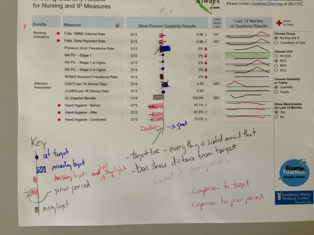
Here’s where I was with the dashboard back in April…the layout is definitely influenced by some of the mockups in the first edition of Stephen Few‘s Information Dashboard Design. The dashboard is for nursing unit leaders and executives, and meant to quickly show performance on a variety of different metrics. One factor in working with clinicians is that they are incredibly focused on their patients. In that brief amount of time that they are looking away from patients to review their metrics, they need information they can take immediate action on. In this case, I was thinking about the nurse manager who has five or ten minutes to review data before the phone rings with a new issue demanding attention.

Unfortunately, this dashboard wasn’t meeting my requirements:
- The red circles next to the Fall and Hand Hygiene Rates are a signal to pay extra attention to the metric – they indicate that the metric is below target and is a high priority for the organization – but were often missed by users.
- And, even more, the bar charts in the middle – that high visibility, “get the most attention here” – space were hard to read. Metrics like the Falls rates at the top are “lower is better” while others like the Central Line Insertion Bundle are “higher is better”, so users would have to mentally switch between looking for shorter and longer bars.
- A metric with a target of 0 like CLABSI per 1000 Device Days (Central Line Associated Bloodstream Infections, a preventable hospital-acquired condition) ends up using minimal pixels, so if we’re at 0 pixels then that’s “high” performance for the measure. Conversely, a metric like Hand Hygiene might have a lot of data-ink for an underperforming measure and the the combination of two is confusing when our general expectation is that bigger bars are better. Even though I did some tricks with the calculated fields to scale the bar sizes to fit the appropriate range for each metric, this was still a problem.
- Using reference lines to indicate targets gets confusing for lower is better measures because Tableau’s reference lines are drawn on top of the already-too-small marks. This can be solved using reference bands, but there are minimal sizes for reference bands that are bigger than what I wanted.
- And finally, the up and down arrows required explanation and a different orientation – they indicate change from the most recent prior metric results, and are oriented so that up is good and down is bad, regardless of the “lower is better”/”higher is better”
I kept on thinking I wanted something like a bullet graph, but couldn’t wrap my head around how to communicate performance compared to target. So I sent out a few emails asking for help, and got responses from Anya A’Hearn - winner of the 2012 Tableau Iron Viz Challenge – and Stephen McDaniel - co-author of Rapid Graphs with Tableau. That lead to a bunch of emails back and forth and one breakthrough screensharing session.
Here was one of the first drafts from Anya. It uses a different color scheme that matches SMMC’s corporate colors (and is easier to read for color blind folks than the grey/green that I’d started with), uses the stick of the lollipop to show where the last period was, and the circle to show current performance, and sets up bands that have the target area in grey, a blue line marking the target, and red line marking the end of the range. The lollipop stick and circle were both color-encoded for whether performance was meeting target:

I liked the lollipops and their handles, but was stuck on three things: The target range was still really small for a number of metrics, reading the view still required orientation switches from left to right, and the lollipops were too small. This helped me realize that I really wanted this part of the dashboard to do the following:
- flag low performing measures (as compared to target) that have a high organizational priority
- flag low performing measures
- flag measures that are in target range
- show comparison to prior period
That’s when I had the webex with Stephen McDaniel. He offered up a key insight, that he likes to orient such views around a single axis, such as “up is good/down is bad”. I’d been doing that already with the up and down arrows, Stephen helped me see that it could work for the main part of the view. Another suggestion was to use a parity line/target line/midline, where the bars could indicate a “distance to target” instead of trying scale to a 0 to N range. I was already scaling the data in my original workbook, so scaling everything to a standardized axis range (like -100 to +100) was conceivable. Here’s the hand-drawn draft that came out of that webex:
So the next steps were to put together a proof of concept in Tableau of how these might look for a range of data. Here was my first attempt, where I was still stuck on using bars:

I realized as I looked at these bars that I didn’t really care for having big bars, that I was more interested in where the end of the bar was. So I went back to that lollipop idea of Anya’s, and brought in Andy Cotgreave’s work on lollipop charts for the Data Studio (now part of Interworks) to make the ‘lolly’ bigger:

This was getting somewhere, though I was still color-encoding the lollipop sticks with whether or not the prior performance was in target range, and similar to the realization about the end of the bar being the important bit, I figured out that the end of the stick communicated enough.
I looked at putting labels on the lollipops, but that got too messy:
I had a few more iterations to go through. Stephen and I had talked about using a dual-encoding of shape and color to help things stand out, so I tried a Consumer Reports-flavored view:

And one with empty circles:

Anya kindly sent in this one with filled shapes:

After these iterations, I realized that the extra encoding of shape wasn’t necessary, there were few enough categories of values indicated by color and position that we didn’t need any more than that. So here’s where we ended up:

- The blue midline marks the target. To the right is meeting the target, to the left is underperforming.
- Flag low performing measures (as compared to target) that have a high organizational priority with red lollipop circle.
- Flag low performing measures with light red/pink circle.
- Flag measures that are in target range with blue circle.
- Show comparison to prior period (usually a month, sometimes a quarter) with the lollipop stick that runs from the prior period’s performance to the current circle. If there is no stick, then performance hasn’t really changed.
And here’s the dashboard:

Users can now scan down, find the red, and do something about it. They don’t have to remember which measures have higher is better, or what the target ranges are, etc. The dashboard gives them several options for action via the tooltips:

- Email or call the quality staff member who is responsible for maintaining the measure and supporting quality improvement efforts around that metric. This is great for cases of data denial – “Those numbers can’t be right?!?” and data helplessness – “What can I do???”
- Review the process control charts for the measure to see common cause vs. special cause. I really would have liked to put the control charts front and center, and as of this writing our organization isn’t quite there yet – folks still like to see comparison to target. (Earlier I’d posted on how to build the control charts yourself.)
- Open one of several other charts that show more details on the particular measure, Year over Year performance, and/or performance compared to other units. Some of these get printed and posted in the units.
- Review and edit the nursing unit’s process improvement plan. This is a Microsoft Word document on a shared drive that is accessed via a URL Action.
We’ve got some ideas for how we can make the dashboard even more actionable, that next iteration will be come after we’ve finished incorporating several dozen more metrics into the dashboard and simplified some of the ones that are already there.
How to Build the Lollipop Chart
In the spirit of helping others build this kind of view (and documenting what I’ve done), here’s how to build your own lollipops. I’ll go through what it looks like in Tableau, what the data is like, and how to get the data to create the view.
The Tableau View
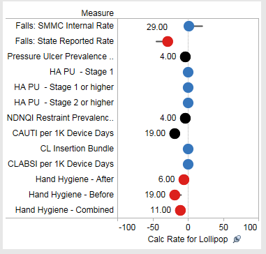
In Tableau, the lollipop chart is a synchronized dual-axis chart with axes from -100 to 100, using a Circle mark for the lolly and a Line mark for the stick. The center line is a reference band, and order of the lollipops is determined by a hidden set of header dimensions:

The Data
The data source for the workbook is a Tableau data extract. Behind that is a set of linked Microsoft Access databases (we’re a non-profit hospital with a small budget) set up in a snowflake schema. The Tableau data connection is to a complicated Access query that pulls information from a variety of tables and subqueries. The reason why I do this rather than a Multiple Tables or Custom SQL connection is for the following reasons:
- We have to use some subqueries anyways, so why not build the whole query in Access.
- As many faults as I can find in Microsoft Access, building queries in it is easier than writing raw SQL in the Custom SQL window.
- I prefer to keep the number of places where I’m manipulating/rearranging/aggregating data to a minimum, so between Tableau calculated fields, the data connection, and the underlying query, I make the data connection simple and move the manipulations to Tableau and the query.
In the Access database, each metric (or measure) has the following static information, stored in a dimension table (there’s a lot more, this is just what’s necessary for the lollipops):
- Measure Name – uniquely names the metric
- Measure Dashboard Header – for layout
- Calculation Type – how the measure will be computed, some are counts, some are rates, along with the unit type (% or number)
- Decimal Places – # of decimal places to display
- HigherRateIsBetter – boolean that indicates whether the target is higher or lower
- Target Rate – this is actually somewhat dynamic as it changes once per year or sometimes more frequently, going into all the details is beyond the scope of this post
- Target Worst Limit – determines the scaling of the metric to the lollipop chart, roughly equal to the worst performance in the last few years modified by experimentation to find out what creates some visible movement when there is change in the values
- Stoplight Type – This is used to indicate which metrics are high priority and can actually get a full red stoplight when below target.
And each metric has the following dynamic information, stored in a fact table with a row for each distinct measure result:
- Measure Date – when the metric was recorded
- Hospital Unit – what floor or department the measure is for
- Date Aggregation (aka Window) – we pre-aggregate the metrics at monthly, rolling quarterly, and rolling annual time periods
- Latest Measure Flag – this is generated by the query that is used to build the Tableau data extract, it’s useful for simplifying computations in Tableau and improving performance
- Numerator, Denominator, and Rate – these are the key bits of what is displayed
The Data in Tableau
Besides the filters for a specific Hospital Unit or Group of measures, and the date aggregation, there’s one more filter in the Lollipop worksheet:
The Latest 2 Measure Dates Flag is a calculated dimension that takes the Latest Measure Flag and does some magic with DATEADD() and DATETRUNC() to grab the prior period’s measure information.
This leads to there being two rows in the view for most every metric – the current month and prior month, and that gives us enough detail to build the view.
Calculations for the Stick
The lollipop stick is make of Line Marks, there are two calculations (I’ve simplified the aggregations here). The first linearly scales the metric to a range based on the Target Worst Limit at -100 and the Target Rate at 0. Since a given result could be below -100 (and therefore off the end of the chart), a second calculation takes anything -94 or lower and adjusts it to -94 to keep it on the chart, but slightly cut off to look like it’s heading off the charts – here you can see the lolly getting cut off:

//Lollipop Line Feeder
-([Target Rate]-[Rate])/ ([Target Rate]-[Target Worst Limit Value]) * 100
//Lollipop Line
//adjust to make sure that any values that would generate a result off the chart
//stay on the chart at the left edge. sacrificing accuracy to preserve at least
//a bit of information.
IF [Lollipop Line Feeder] <= -94 THEN
   -94
ELSE
   [Lollipop Line Feeder]
END
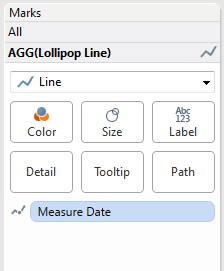
On the Marks Card for the Lollipop Line measure is the Measure Date on the Path Shelf:
 In my view there are a bunch of other measures and dimensions in the view to generate the tooltips.
Calculations for the Lolly
Since there should be only one circle for the lollipop, Measure Date won’t be on the level of detail. But the view has filtered for two measure dates, so there’s a row level calculation to get the latest rate that looks something like this:
//Rate (Latest)
MIN(IF [Latest Measure Flag] THEN [Rate] END)
Then there’s a feeder calculation followed by the actual lolly calc, similar to what was done for the line so the marks won’t get drawn to the left edge:
//Lollipop Circle (Latest) Feeder
-([Target Rate])-[Rate (Latest)])/([Target Rate]-[Target Worst Limit Value]) * 100
//Lollipop Circle (Latest)
IF [Lollipop Circle (Latest) Feeder] < -94 THEN
    -94
ELSE
    [Lollipop Circle (Latest) Feeder]
END
And to appropriately color the lolly, the calculation has to do a comparison against target, and this is where we put some intelligence into the calc for higher or lower is better:
IF MIN([HigherRateIsBetter Flag]) == 1 THEN
    IF [Calc Rate (Latest)] >= MIN([Target Rate]) THEN
        "Met Target"
    ELSE
        CASE MIN([Stoplight Type ID])
            WHEN 1 THEN "Did not meet Target"
            WHEN 2 THEN "Did not meet Target and High Priority"
        END
    END
ELSE
    IF [Calc Rate (Latest)] <= MIN([Target Rate]) THEN
        "Met Target"
    ELSE
        CASE MIN([Stoplight Type ID])
            WHEN 1 THEN "Did not meet Target"
            WHEN 2 THEN "Did not meet Target and High Priority"
        END
    END
END
The Midline Target
Tableau draws reference lines on top of marks, and I wanted the midline target to be in the background. So I used a reference band, which is set up to be wide enough in the view to have a presence:
Adding the Target Range
Some measures have a range of target values, such as Falls with Injury where the Maine state target is 0.7 falls per 1000 inpatient days – anything between 0.7 and 0 is in the target range. Those are shown in the lollipop chart and the sparkline portion of the dashboard via reference bands that use calculated fields that return the target values when the Show Targets parameter is True, and Null when the target value is False:

To set up the lollipop band, here are the calculations:
//Lollipop Target Feeder
IF ([Calculation Type ID] == 2 AND [Target Rate] == 1)
  OR ([Target Rate] == 0) THEN
  //% measures with target of 100% or measures with a target of 0
    1.5
ELSEIF [Calculation Type ID] == 2 AND [Target Worst Limit Value] == 0 THEN
    (1-[Target Rate])/([Target Rate] - [Target Worst Limit Value]) * 100
ELSE
    -[Target Rate]/([Target Rate] - [Target Worst Limit Value]) * 100
END
//Lollipop Target
IF [Show Targets] THEN MIN([Lollipop Target Feeder]) END
And here’s the reference band:

Conclusion
Thanks to Anya A’Hearn and Stephen McDaniels for their help, and everyone else I’ve learned Tableau tricks from. If you’d like to check this out yourself, here’s a sample data file and Tableau packaged workbook:
I hope this is helpful to you, it’s been fun to write about and share with people. If you have any questions, comments, or criticisms, please let me know!